LOGOS
ALT STATE OF MIND
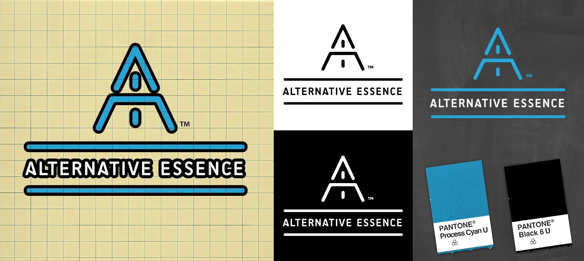
Created for a cannabis retail shop in Maine, Alternative Essence was designed to establish a clean, modern identity in a newly regulated and competitive market.
The logo is built from a stacked “A” over “E,” forming an upward-pointing arrow that represents elevation, progress, and forward movement.
The mark was designed for strong recognition at small sizes while maintaining clarity across signage, packaging, and digital applications.
A cyan and black color palette creates strong contrast and a modern retail feel. Cyan communicates freshness and clarity, while black adds structure and simplicity. The result is a minimal, high-impact identity that is easy to recognize and built for real-world retail use.
PROJECT HIGHLIGHTS
Created one of Maine’s earliest recreational cannabis retail brand identities
Designed the Alt Essence logo featuring a stacked A/E arrow mark
Developed comprehensive brand guidelines and standards
Designed and launched the company’s first website
Created retail merch including shirts, hoodies, snapbacks, and stickers
Established a scalable visual system for retail and promotional use
Helped position Alt Essence as a modern cannabis retail brand in Maine
Built a scalable brand system to support in-store retail, packaging, and digital launch across a newly regulated market
Trusted by leading cannabis brands