LOGOS
PREMIER CANNABIS
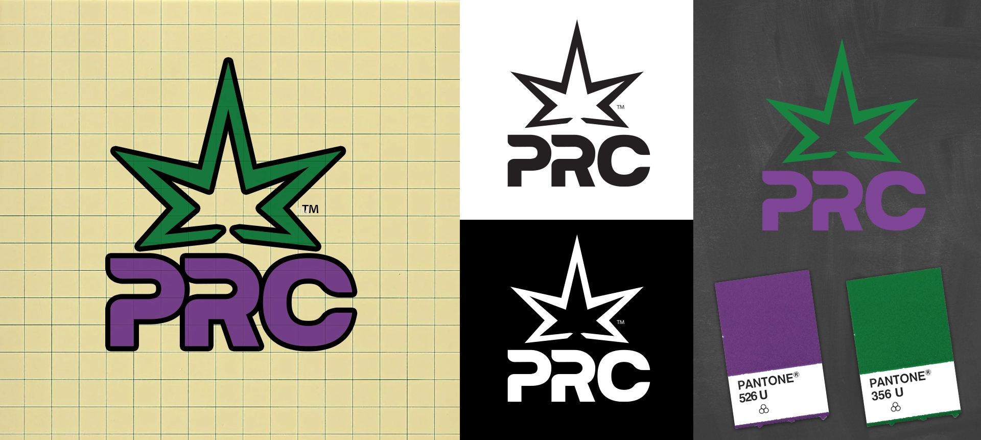
Created for one of Washington State’s early cannabis operators, Premier Recreational Cannabis (PRC) was designed to evolve a legacy medical brand (originally 221 Inc., founded in 2013) into a modern, scalable recreational retail identity.
The logo is built around a structured shield mark, designed to communicate stability, trust, and institutional presence within a highly regulated retail environment. The form was created for strong recognition across storefront signage, packaging, apparel, and digital applications while maintaining clarity at small sizes.
A purple and green color system bridges legacy cannabis signaling with a more refined retail expression. Purple reinforces premium positioning and brand maturity, while green maintains clear category recognition within the cannabis industry.
The result is a balanced identity system that feels established, modern, and built for multi-location retail expansion.
PROJECT HIGHLIGHTS
Served as lead creative agency for PRC since 2013, beginning with its early medical operations as 221 Inc.
Designed the PRC shield logo identity system during the brand’s transition from medical access point to recreational retail expansion
Developed the logo to function across multi-location storefront signage, packaging, apparel, and digital applications
Created a structured mark system focused on clarity, recognition, and scalability within regulated retail environments
Established a visual identity designed to maintain legibility and impact
Built the foundation for a unified brand system that bridges legacy medical roots with modern recreational retail positioning
Supported the evolution of the logo system into ongoing advertising, packaging, and in-store brand applications
Built a scalable identity framework supporting storefront retail, packaging, advertising, and digital applications across a regulated market
Trusted by leading cannabis brands