LOGOS
ROYAL RELIEF
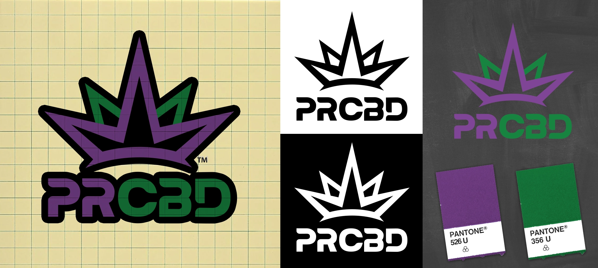
Created as the sister brand to Premier Recreational Cannabis (PRC), PRCBD was designed to expand the existing brand family into a wellness-focused CBD identity for both people and pets.
The logo is built around a refined crown mark paired with a custom wordmark, designed to signal trust, care, and premium wellness positioning while maintaining visual connection to the PRC parent brand.
The system was developed to feel familiar within the brand family, while still establishing its own distinct presence across retail and product environments.
A coordinated color system and custom typography extend the PRC visual language into a softer, wellness-oriented expression. The palette maintains family continuity while shifting toward a more approachable, health-forward tone suited for CBD products for both human and pet use.
The result is a cohesive but independent identity built for retail expansion, product versatility, and cross-category brand recognition.
PROJECT HIGHLIGHTS
Trusted by leading cannabis brands