LOGOS
READY PLAYER 1
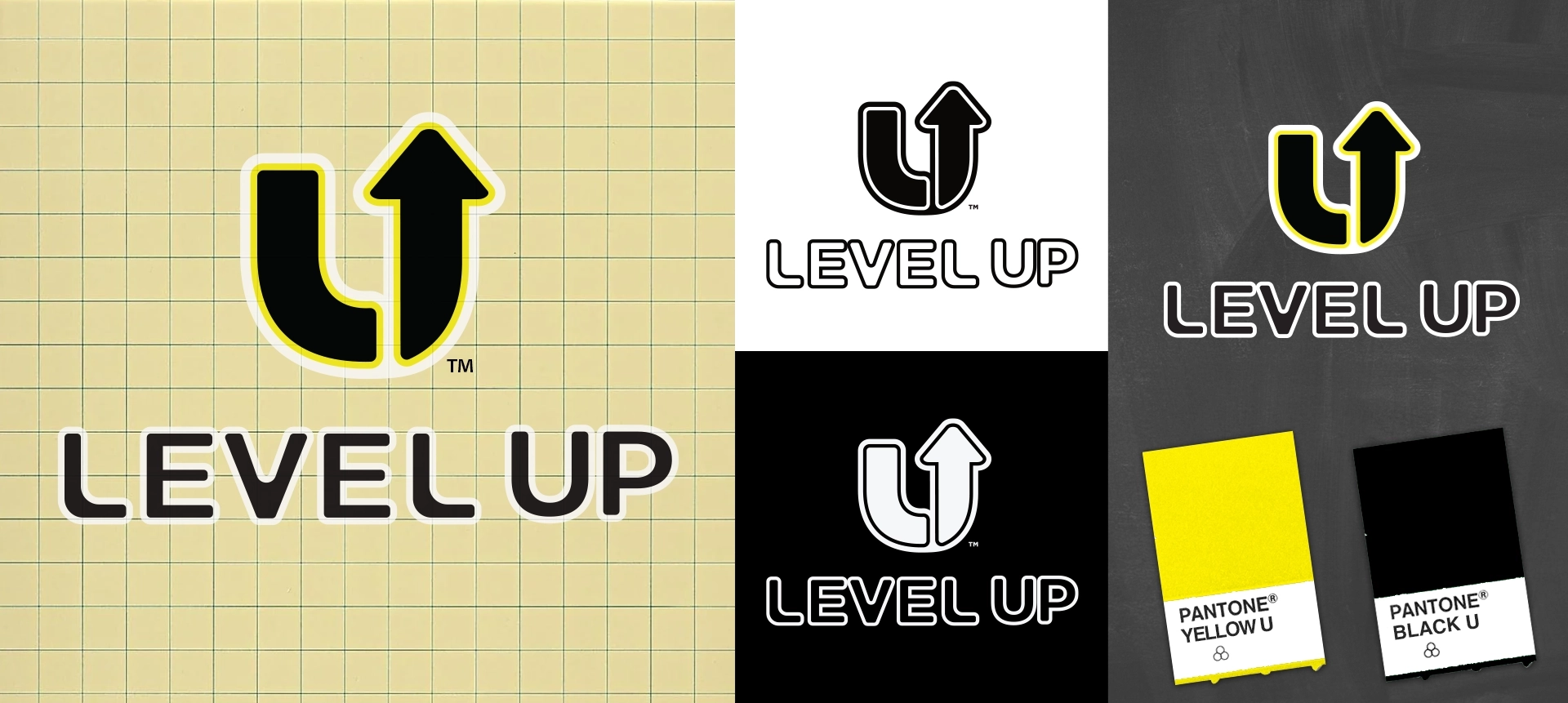
Created for Washington State cannabis brand Level Up, the identity was designed around themes of progression, achievement, and forward momentum.
The logo is built from a custom “L” and “U” monogram that forms an upward-pointing arrow, symbolizing growth, elevation, and the idea of “leveling up.”
The mark was designed for strong recognition across packaging, retail, and digital applications while maintaining clarity at small sizes.
A high-contrast yellow and black color palette reinforces energy, visibility, and gaming culture.
The result is a bold, modern cannabis identity built around movement, progression, and retail impact.
PROJECT HIGHLIGHTS
Trusted by leading cannabis brands