LOGOS
BO-WOW-WOW
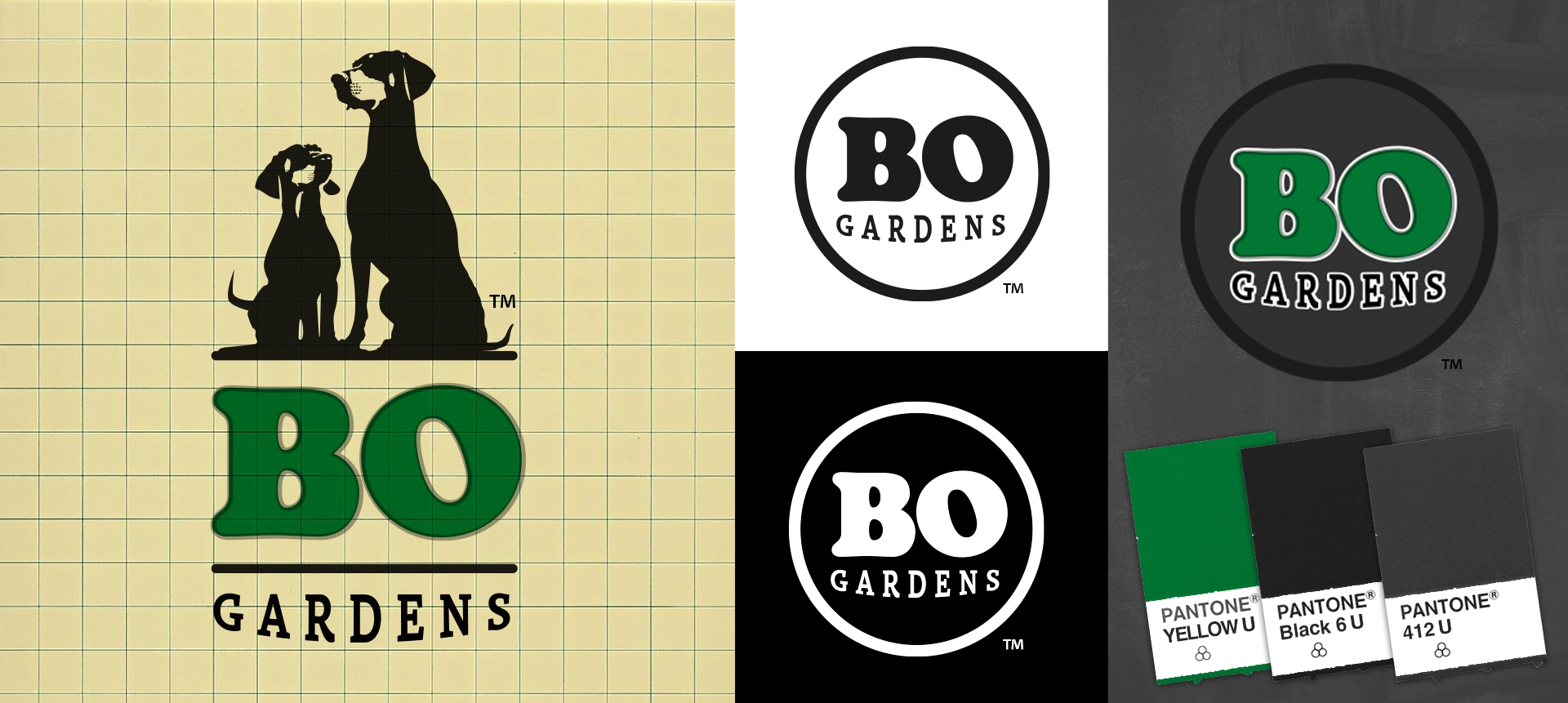
Created for Bo Gardens, a cannabis flower farm with a dog rescue-inspired mission, the identity was designed to celebrate the bond between cultivation, community, and canine companionship. Rooted in the owners' passion for both premium flower and animal advocacy, the brand was developed to feel approachable, authentic, and memorable within a crowded retail market.
The primary logo features illustrations inspired by the owners' two dogs, creating a distinctive mark that reflects the personality and heart behind the brand. A simplified secondary logo was developed using custom typography within a circular badge, providing a flexible identity for packaging, merchandise, signage, and promotional applications.
A green, black, and gray color palette reinforces the agricultural roots of the business while maintaining a clean, modern retail presence. The identity system was designed to scale across retail, events, digital platforms, and branded merchandise while supporting a unique product lineup where each flower strain is inspired by a different dog breed. The result is a welcoming brand identity that stands apart through storytelling, authenticity, and a playful connection to dog lovers and cannabis enthusiasts alike.
PROJECT HIGHLIGHTS
Trusted by leading cannabis brands